When Kitchen and Bath Design News (KBDN) asked expert interior designers to share projects and design tips that take white kitchens to a new level, our ears perked up. The ever-so-popular request for an all-white kitchen can be hard to accomplish. Read the interior design tips first seen in KBDN to nail your all-white kitchen, -or almost all-white kitchen design.
Doing White Right
White kitchens can conjure up a variety of emotions, but designers are finding ways to elevate them from boring and standard to fresh and new.
AUTHORS Kim Berndtson | September 2, 2021

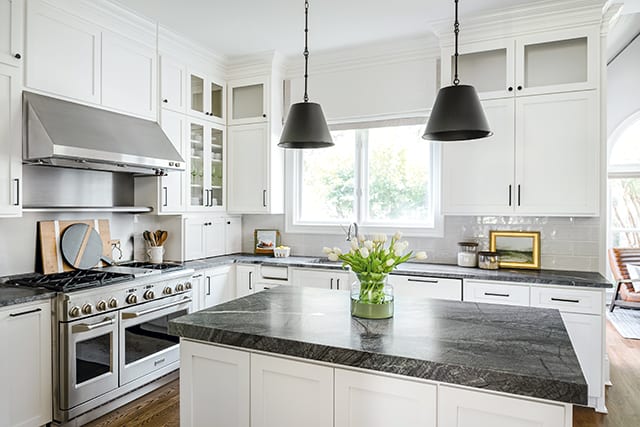
Jena Bula collaborated with Ekren Construction to include white cabinetry as a base that is complemented with dark gray quartzite countertops and a lighter warm gray porcelain tile backsplash for dimension. Photos: Tiffany Ringwald
When designers hear their clients utter the request, “I want a white kitchen,” it can be met with dread or excitement…or a mix of both. Regardless, whether designers love them or hate them, white kitchens continue to be immensely popular with homeowners.
Often defined and characterized by their foundation of white cabinetry, a white kitchen’s impartial palette gives it a go-with-anything neutrality that can serve as a backdrop for the introduction of color and personality via other design elements. However, when combined with an abundance of white elements, especially countertops and backsplashes, white kitchens can turn into a monochromatic sea of sameness.
This month, KBDN asked designers to share projects and design tips that take white kitchens to a new level.
Jena Bula collaborated with Ekren Construction to include white cabinetry as a base that is complemented with dark gray quartzite countertops and a lighter warm gray porcelain tile backsplash for dimension.
Jena Bula, principal designer
Delphinium Design; Charlotte, NC
When discussing white kitchens, Jena Bula’s clients still often ask for white cabinetry.
“They want an aesthetic that is lighter and brighter with an airy feel,” she says. “While there are different ways to achieve that, people often associate it with white.”
However, she has noticed a bit of a shift in what exactly that means and what else is included.
For starters, white doesn’t always mean bright white.
“There are so many different ways to do white,” she says. “It can mean bright white, but it can also mean a warm white or a country white depending on the space, the aesthetic and what other colors are included.”
Plus, clients also seem more open about bringing in other colors.
“There was a time when white kitchens were a lot of
white-on-white-on-white,” she indicates. “But now, they seem to have a little more dimension. People are mixing in different colors and warmer materials. White kitchens aren’t always all-white cabinetry, white countertops and white islands.”
Such was the case for a recent kitchen remodel completed in collaboration with Ekren Construction. White shaker cabinets serve as the base, but Bula brought in dark gray quartzite countertops and a lighter warm gray porcelain tile backsplash for added dimension.
“She didn’t want a white-on-white kitchen,” says the designer. “Countertops are an important element in the space. My client needed something durable because she cooks a lot for her family, so the dark quartzite was a great choice for functionality. It also has some texture from its honed and leathered finish, which gives it dimension. It’s a really special element, and in-person you can really see that texture.”
Flooring is another way that Bula freshens up today’s white kitchens. Often, she chooses to use warmer-toned hardwood for balance. Lighting and plumbing fixtures, as well as hardware, can also add diversity.
“We used dark hardware in this kitchen, which gives it great balance so everything isn’t all light and bright,” she says. “Fixtures, such as a really cool faucet or fun pendants, and hardware are also a great way to add personality.”
Crystal Kitchen and Bath Design Build – 2506 Tournament Players Cir S, Blaine, MN 55449
Mary Maney, CKBD, ASID, CLIPP
Crystal Kitchens + Bath; Crystal, MN
As a designer with a remodeling company, Mary Maney sees a lot of outdated kitchens, especially those from the 1980s with their distinctive abundance of oak…including oak cabinetry, oak flooring and oak trim.
“People want to tone that down so everything isn’t the same,” she says. “They also want to get rid of the busyness of oak, which, in those dated kitchens, usually has a lot of grain. Often, they do that by keeping the oak floor, and sometimes the oak trim, but they replace the oak cabinetry with white cabinetry. White doesn’t necessarily designate a decade or date a kitchen as much as wood like oak, maple or cherry. White is also popular because it allows everything else – such as a countertop, backsplash, flooring and island – to stand out.”
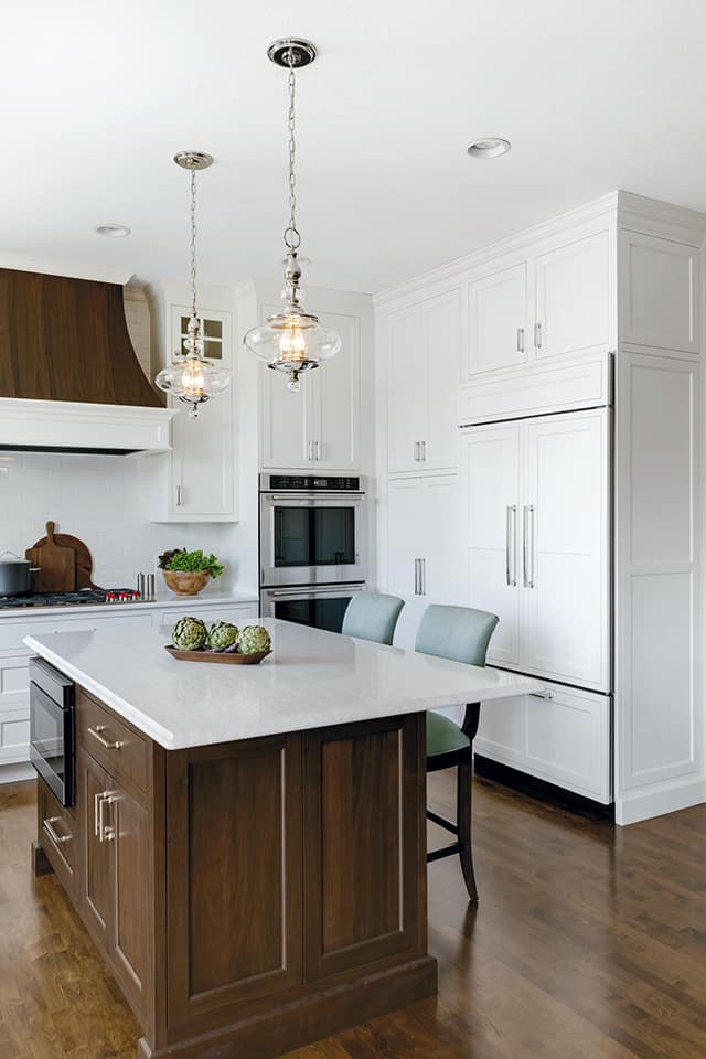
White inset cabinetry serves as the ‘quiet’ backdrop for one recent kitchen remodel where Maney’s client wanted a ‘statement’ ventilation hood that would serve as the focal point for the room. Reconfiguring the space, the designer eliminated an awkward, angled walk-in pantry to pave the way for the inclusion of a walnut hood that echoes the tones of the dark floor and island base cabinetry. She also tied the kitchen into the adjacent living room by replacing the existing maple bookcases that flank the fireplace with walnut bookcases.
“My client had redone the maple floor a few years previous with a dark stain,” she indicates. “She didn’t want an all-white kitchen, so it seemed logical to include other dark elements. We chose walnut because it allows some grain to show through, which provides texture and isn’t quite as harsh as black. Walnut also gives the kitchen an ‘upscale’ look that she wanted.”
A quartz countertop with a subtle gray veining pattern with ‘movement’ and a backsplash that features a light crackle finish reinforce the white theme while offering variety.
“You don’t want elements of the same color to all have the same tone,” she says. “When that happens, there’s nothing to define the different planes. It’s important to have some contrast.”
Adding paned glass doors to select perimeter wall cabinets also adds interest and makes this space feel special.
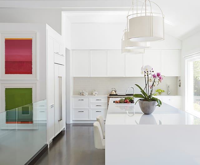
In this kitchen Scott Dresner celebrates timelessness and diversity by combining white perimeter cabinetry, white paneled refrigerator and white quartz countertops with gray cerused oak island cabinetry ‘framed’ in a waterfall of white quartz.
Photos: Jim Tschetter
Photos: Jim Tschetter
Scott Dresner
Dresner Design; Chicago, IL
Scott Dresner credits, in part, his love of white kitchens to growing up in a modern home with a white kitchen in Detroit, MI. Now, he incorporates that love of white into his kitchen design business.
“I’m pro-white kitchens,” he stresses. “The white kitchen – and stainless – is my favorite. White kitchens definitely are not dead.”
Part of that affection is due to its classic design appeal.
“A white kitchen will stand the test of time,” he says. “There are still mill shops making the same [cabinet] door they made in the ‘80s. A white kitchen is like Jackie Onassis and Marilyn Monroe…beautiful and timeless.”
Dresner also appreciates the hue’s diversity.
“There’s super modern bright white, warm white, cream white, off white…” he says, referencing a variety of white kitchens posted on his website. Some showcase multiple white elements, including one recent renovation that includes sleek, smooth, bright white back-painted glass cabinetry and a white quartzite countertop with a waterfall edge. Silver trim border details on the cabinets tie them to the countertop’s gray veining pattern, floor and stainless steel appliances. Conversely, another white kitchen features more traditional paneled cabinetry painted in a creamier white, similar to the color of a cameo, which he contrasted with a brighter white coffered ceiling to create separation. Dresner also included a natural stone white/gray veined countertop and matching accent wall and stainless steel appliances.
“I often use stainless steel appliances in white kitchens,” he says. “The combination is like peanut butter and jelly.”
While variations of white with stainless steel dominate some designs, others highlight a mix of materials, including one kitchen that combines white perimeter cabinetry, white paneled refrigerator and white quartz countertops with gray cerused oak island cabinetry ‘framed’ in a waterfall of white quartz. Dark wenge drawer interiors, visible when exposed, provide dramatic contrast.
“It certainly feels like a white kitchen, and everyone considers it a white kitchen,” he says.
This time, the designer blended the cabinetry with the wall color and ceiling beams to create a seamless visual.
“I wanted the cabinetry to essentially go away, to blend into the wall so the huge picture windows ‘speak’,” he says. “There is a lot of white in this kitchen, but it isn’t a sterile space. There are parts of ‘sterileness,’ such as the countertop that is white and shiny. But the rest of the whites have a matte finish so that, overall, there is a Zen, quiet feel to the space. People love this kitchen.”
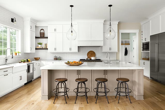
Christina Simon and senior designer Brittany Gunst joined forces in this kitchen to create a modern farmhouse vibe with timeless elements, plenty of storage and an open concept…all with a foundation of white cabinetry, white countertops and a white backsplash. The reclaimed wood shelves serve as a statement piece and the taupe/gray painted island complements the veining pattern in the countertops.
Photo/Styling: Stylish Productions; Charlotte Safavi and Robert Radifera
Photo/Styling: Stylish Productions; Charlotte Safavi and Robert Radifera
Christina Simon, CKBD, ASID, president
c|s Design Studio; Clifton, VA
Christina Simon works in a relatively traditional part of the country – the Washington DC suburbs – where she often fields requests for white kitchens.
“People here simply love them, and we’re happy to oblige,” she says. “White is timeless, clean and bright…all things people want for their kitchens. White is also neutral and plays well with others, making it easy to coordinate with appliances and hardwood floors, which is a big element for us.”
These days, the white kitchens she designs often include updates via natural and rustic elements as a complement.
“We introduce texture and contrast into the space to make it more interesting,” she explains.
As an example, she and senior designer Brittany Gunst recently joined forces on a remodel where the clients wanted their new kitchen to have a modern farmhouse vibe with timeless elements, plenty of storage and an open concept…all with a foundation of white cabinetry, white countertops and a white backsplash, as well as a white farmhouse sink, which is another popular choice for her clients.
“When there is a lot of white, it’s important to bring in some statement pieces,” she notes. “In the case of this kitchen, the statement piece is some reclaimed wood corner shelves.”
Additionally, Simon indicates that black accents can add contrast, so she brought in black cabinetry hardware and lighting. In another recent remodel, she made a striking statement with a black ventilation hood.
To provide differentiation amongst white elements, Simon utilizes a variety of sheens throughout a space, such as in this kitchen where the matte finish of the cabinetry plays against the glossy sheen of the elongated 3″x12″ subway tile backsplash.
“This client wanted a simple subway tile backsplash,” she reports, “but its glossy sheen sets it apart from the other white elements. We also like to use handmade tile, which can have different glazing or it may be a slightly different white, such as an off white. We’re seeing a lot of people using a variety of different whites in their kitchens.”
When using white as a countertop, Simon likes to include materials with some veining, such as a marble or marble-look quartz.
“Instead of plain white, we like to use something with a light veining pattern against a white background, because those veins allow us to pull in other colors,” she explains, citing the marble-look quartz in this kitchen that gave them the opportunity to incorporate a taupe/gray painted island.
In this remodel, Nicole Zeigler contrasted the white cabinetry and white backsplash tile with a custom edge-grain walnut bar top on the island and walnut floating shelves that coordinate with floor, as well as a custom hot-rolled steel ventilation hood.
Photo: Lucy Call
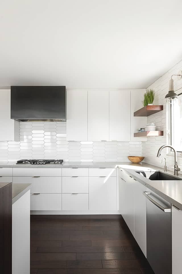
Photo: Lucy Call
Nicole Zeigler, NCIDQ
enzy design; Salt Lake City, UT
With a trend towards design that integrates a furniture-style appeal, Nicole Zeigler sees many of her white kitchens offering an assortment of materials beyond just white.
“White kitchens are definitely still popular,” she says. “They never go out of style. They have always been around, and they will continue to be around. But I am seeing more mixed materials rather than straight white. I think that’s because, overall, there’s a trend in kitchen design that incorporates furniture-look pieces, rather than all of the same cabinets. For example, you might see an island with a wood finish and a furniture-style base, or something unique.”
Zeigler sees that updated look as offering a way to add personality and warmth to the space. In particular, wood – or even wood-look vinyl – floors are popular. The designer also adds personality via ventilation hoods or accent cabinets and hardware, which she dubs as the ‘jewelry.’ She also indicates there is still a trend for open floating shelves in a material or finish that offers a contrast to white.
Several of those elements were included in a recent renovation, where gloss white wall cabinets are combined with natural rift-cut oak base cabinets. The hood and the cabinets around it feature a charcoal finish.
“It’s stunning,” she says. “I feel like it’s still a white kitchen, but it’s not an in-your-face-white kitchen because of the other elements we’ve added to it.”
In another kitchen, where she collaborated with cabinet maker/installer Paramount Cabinet and builder Spiro Brothers Construction, wall and base cabinets are white, as is the island cabinetry and the backsplash, which is comprised of elongated hexagon-shaped subway tile. The tile’s glossy finish adds reflectivity while its geometric shape adds interest, without making it busy. However, to mix it up, she included a custom edge-grain walnut bar top on the island that coordinates with the floor and a few floating shelves that frame the window to make it feel more open.
“The wood bar top and shelves bring natural elements into the room and add some contrast,” she says. “They also bring up some of the darkness from the floor to create more balance, without overwhelming the light space.”
Another ‘dark’ element is the custom hot-rolled ventilation hood.
“It’s a really simple box shape,” she says. “But it has a beautiful finish that offers natural depth and subtle marbling. It’s gorgeous against the white backdrop.”
Quartz countertops that mimic honed concrete and slightly oversized pendants that offer the feel and look of linen also prevent the white space from being too sterile.
“Having those elements – the backsplash, the shades, the bar top, the ventilation hood and the countertops – are all important to make this white kitchen more inviting and less institutional,” she says, “especially since it has white slab cabinetry.”
Tamra Pumpelly often uses white cabinetry’s door style and construction to set the tone in a space. In this kitchen, inset cabinetry was appropriate given the historic value of the home. She included a flat-cut white oak island, stained in Driftwood, to add warmth and depth. Incorporating it as an accent on the ventilation hood brings up the eye and ties the perimeter and island together.
Photo: Steve Hershberger
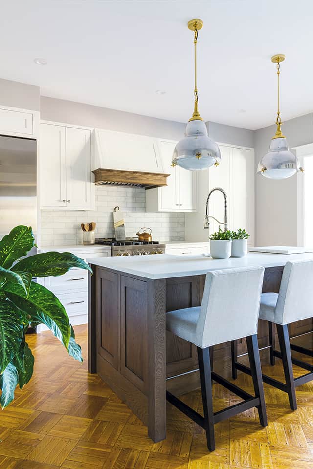
Photo: Steve Hershberger
Tamra Pumpelly, operations manager
District Cabinets; Washington DC
Even though Tamra Pumpelly indicates that white kitchens can be a ‘safe’ choice for her clients, that doesn’t mean they can’t be special and beautiful.
“White cabinets can become a backdrop of a kitchen, rather than them being the focal point,” she explains. “Quality cabinetry is expensive, and I think homeowners see it as an investment they want to get right. Elements like hardware and lighting are easier to change out.”
As the foundation, those same white cabinets can also set the tone with their door style and construction.
“An inset or mission door style sets a completely different tone than a slab door,” she says. “The sheen factor also changes a kitchen. A rich matte finish represents a completely different style than a gloss finish.”
As an example, in one recent kitchen remodel, the designer collaborated with Build by Four Brothers to incorporate white inset Elmwood cabinets into their clients’ new kitchen.
“Inset cabinetry was appropriate for this kitchen because of the historic value of the house,” she says. “Clients often are concerned with losing storage with inset, but it immediately elevates a kitchen without looking fussy.”
The team also included a flat-cut white oak island, stained in Driftwood, to add warmth and depth. Incorporating it as an accent on the ventilation hood brings up the eye and ties the perimeter and island together.
The white cabinetry also complements the existing hardwood floor.
“Maintaining the floor was important to the client, so we didn’t want to take away from it,” she says. “The white cabinetry allows the floor to be the focal point and we built the kitchen around it.”
In addition, with a neutral foundation of white cabinetry, Pumpelly sometimes brings color or a wood element to an island to ground it while adding warmth and personality.
“Pops of color can also be used in the lighting, and we love mixing metals and textures in white kitchens,” she adds.
In addition, white cabinetry allows countertops and backsplashes to be the stars of the show in a traditional white kitchen, such as in a recent renovation where white cabinetry and white backsplash tile give the dark gray countertop and gray/white chevron backsplash insert the opportunity to stand out.
For more design inspiration, check out Rocky Mountain Hardware Design Inspiration: Minimalist Mid-Century Modern | Emtek Products to Make Your Home Your Own | Wallpaper of the Year, “Restore” Captures the Refreshed State of Mind for 2022
Article Source
Kim Berndtson. “Doing White Right.” Kitchen & Bath Design News, 2 Sept. 2021, https://www.kitchenbathdesign.com/doing-white-right/.

