Excel Marketing represents high-end fixtures to dealers, interior designers, builders, and homeowners. We love design and love to share in-depth articles from design experts on how to achieve certain looks. In this article, expert Allen Halcomb, of MossCreek design, shares four tips – dos and don’ts to keep in mind when aiming for rustic American design.
Dos and Don’ts of Rustic American Style
Midcentury modern, contemporary, rustic-chic, mountain modern—these are all home design styles that are on trend throughout the Rocky Mountain West and beyond. But one of the most fitting designs for the high country is what we call rustic American—a style that blends numerous natural and organic materials with newer fixtures and finishes. When done right, the house will not only lose its “suburban” feel, but it will also appear to grow out of the ground as if it’s connected to the site and to something bigger: the site’s historical relevance. Achieving rustic American design can be tricky to nail down. Achieve the traditional and historical mixed-materials look called rustic American design with these expert tips.
Tip 1
DON’T: Overlook the technical side of natural materials. If you bring standing dead timbers to Minnesota, they risk rotting because they host dormant mold spores from the dry west. And if you bring poplar or birch bark to Colorado, they risk crumbling to pieces because originate from a more humid climate. Make sure to keep the big picture in mind; there are both aesthetic and technical reasons as to why you should choose certain materials.
DO: Look to where the house is sited. A house in the eastern United States should use different materials than a house in the western United States. A Montana-style log home in New England will look imported. If you want something that feels like it settles into the site, choose materials that are local to the region.
Tip 2
DON’T: Use only one material or one color/texture. Using one material runs the risk of the home looking too modern; while modern can be a good choice on its own, it’s a counterintuitive one if you are hoping to achieve this organic mixed-materials look. Part of the value of mixed materials is that it alludes to a part of world history that involved continuous architecture. A house built in 1800 might have added a bedroom in 1850, a bathroom in 1900, and so on.
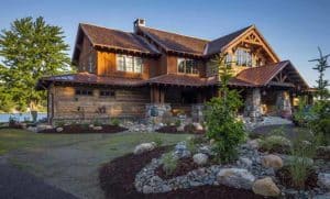
DO: Build layers with your natural materials. There’s a classic form of architectural expression: the ground, the roof, and the architecture between the two. For a rustic American home that hearkens to the days of old, you’ll want to make sure your home’s exterior materials appear to sprout from their surroundings. A stone base is a great way to aesthetically connect the home to the ground. In the example above, you’ll also see horizontal log siding interplaying with a vertically aligned board and batten.
 Tip 3
Tip 3
DON’T: Feel tempted to incorporate ultra-modern trends into your rustic American home design; you’ll want to be careful when using modern materials. An all-white contemporary kitchen or red leather couch might not stylistically complement the 150-year-old hand-hewn beams and the Frank Lloyd Wright craftsman-era color palette.
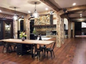
DO: Choose materials that existed prior to World War II. After the Second World War, concepts like Levittown and modern building materials and techniques rapidly entered the scene. With the development of industrialized building materials came a loss of craftsmanship. By referencing a prior era, we give credence to the desired old-meets-new aesthetic. In the kitchen and dining area above, stone and brick are key players—a practice done for centuries when wood-burning ovens commonly caused kitchen fires.
Tip 4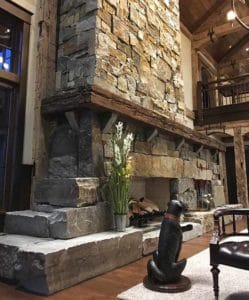
DON’T: Design a house with all rustic materials. Or at least consider that if you do, you’ll end up with a home that feels more like a hunting cabin or an overnight mountain lodge (not a bad choice, just a distinct style). Using all rustic materials can make for a home overly busy with texture and sweater-catching surfaces.
DO: Reach for older materials as the item becomes larger and newer materials as the feature becomes smaller. For many homeowners, a centrist approach is desired, where larger-scale elements are the primary focal points crafted from rustic-antique materials, and the smaller-scale details are made of newer materials. In the photo above, a big, bold stone fireplace dominates the living room—its mantel was distressed to appear over 100 years old, and it’s worth saying that there is no substitute for real stone. The window trim is new wood in a craftsman-style detail. The result is a strong rustic statement that doesn’t need repeating.
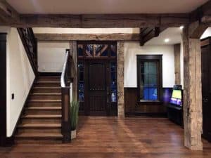 In the entryway shown here, hand-hewn columns and beams take center stage, complete with blacksmith iron strapping. But the front door, hardware, and window trim are all new—the new oak flooring, too, with a rustic walnut finish—add to a sense of formality and balance.
Source:
Allen Halcomb is the president of MossCreek, a residential design firm dedicated to creating custom, one-of-a-kind homes. View their profile, or contact Allen at 800.737.2166 or info@mosscreek.net.
Content for this article provided by MossCreek.

